Use descriptive link anchor texts
Anchor text and the text on buttons should be descriptive. This is so people know what they are clicking on. Table of contents How to add…
Read more, Use descriptive link anchor textsLast updated on January 01, 2022• A11y issues
Ensure that the colour selection for text and their background colours have a high enough contrast ratio.
When there is low contrast, it can be very hard to read text or see what is being presented.
This affects people with sight issues, but also almost everyone in some situations such as using their phone in bright sunlight.
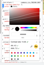
You can easily check the colour contrast ratio in Chrome.
The image below shows the expanded colour view in the inspector - and the white lines indicate where the AA and AAA rating boundaries lie. In this example, it was black text on yellow background so has a high contrast.

https://www.w3.org/WAI/WCAG21/Understanding/contrast-minimum.html:
Success Criterion 1.4.3 Contrast (Minimum) (Level AA): The visual presentation of text and images of text has a contrast ratio of at least 4.5:1, except for the following:
Large Text
Large-scale text and images of large-scale text have a contrast ratio of at least 3:1;
Incidental
Text or images of text that are part of an inactive user interface component, that are pure decoration, that are not visible to anyone, or that are part of a picture that contains significant other visual content, have no contrast requirement.
Logotypes
Text that is part of a logo or brand name has no contrast requirement.
https://www.w3.org/WAI/WCAG21/Understanding/contrast-enhanced.html
Success Criterion 1.4.6 Contrast (Enhanced) (Level AAA): The visual presentation of text and images of text has a contrast ratio of at least 7:1, except for the following:
Large Text
Large-scale text and images of large-scale text have a contrast ratio of at least 4.5:1;
Incidental
Text or images of text that are part of an inactive user interface component, that are pure decoration, that are not visible to anyone, or that are part of a picture that contains significant other visual content, have no contrast requirement.
Logotypes
Text that is part of a logo or brand name has no contrast requirement.
https://www.w3.org/WAI/WCAG21/Understanding/non-text-contrast.html
Success Criterion 1.4.11 Non-text Contrast (Level AA): The visual presentation of the following have a contrast ratio of at least 3:1 against adjacent color(s):
User Interface Components
Visual information required to identify user interface components and states, except for inactive components or where the appearance of the component is determined by the user agent and not modified by the author;
Graphical Objects
Parts of graphics required to understand the content, except when a particular presentation of graphics is essential to the information being conveyed.
Please consider sharing this link with your work colleagues or on social media. There are no ads on my site, I just want to promote accessibility.
Found an issue? please point them out - let me know if there is a mistake and I'll update it
Follow me on Twitter: @A11yForDevs. I post links to interesting a11y articles and resources.
Anchor text and the text on buttons should be descriptive. This is so people know what they are clicking on. Table of contents How to add…
Read more, Use descriptive link anchor textsYou should not rely on colour alone to convey information, as not everyone can see the difference between colours. Table of contents…
Read more, Avoid using colour alone to convey information